| View previous topic :: View next topic |
| Do you plan on purchasing a 2008 Fats jersey? |
| No |
|
15% |
[ 4 ] |
| Yes-S |
|
11% |
[ 3 ] |
| Yes-M |
|
19% |
[ 5 ] |
| Yes-L |
|
53% |
[ 14 ] |
|
| Total Votes : 26 |
|
| Author |
Message |
Big Baby Jesus

Joined: 06 Nov 2006
Posts: 85
Location: Shaolin
|
 Posted: Sun Dec 30, 2007 9:49 am Post subject: Posted: Sun Dec 30, 2007 9:49 am Post subject: |
 |
|
Word!!!!!!!!!!!!
I really like the argyle too.
_________________
You aint ringing a bell |
|
| Back to top |
|
 |
Tim845

Joined: 02 Sep 2006
Posts: 3684
Location: Poughkeepsie
|
| Posted: Sun Dec 30, 2007 3:15 pm Post subject: |
|
|
Ditto on the map 
_________________
Pedal, b*tches!! |
|
| Back to top |
|
|
Forest_biker
Joined: 16 Sep 2006
Posts: 859
|
| Posted: Sun Dec 30, 2007 6:23 pm Post subject: |
|
|
I'd like the argyle in a earth tone palette.
...but really there are some cool designs going on and I'm not picky.
Thanks for the work.
Chris |
|
| Back to top |
|
|
TriassicDoc
El Presidente

Joined: 25 Mar 2007
Posts: 1235
Location: Poughquag
|
| Posted: Sun Dec 30, 2007 7:56 pm Post subject: |
|
|
| artcrimes wrote: |
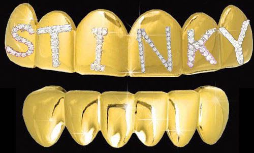
i think fats in the cats gangsta grillz might be a good look |
OOOOH, BLING!!! |
|
| Back to top |
|
|
g60dude

Joined: 31 Aug 2006
Posts: 1303
Location: Mid-town Lake Katrine
|
| Posted: Mon Dec 31, 2007 9:40 am Post subject: |
|
|
With the map, what if each letter featured the town where local trails are located.?
_________________
greg
 |
|
| Back to top |
|
|
TACO SHACK
Joined: 16 Nov 2007
Posts: 169
|
| Posted: Mon Dec 31, 2007 9:49 am Post subject: |
|
|
| g60dude wrote: |
| With the map, what if each letter featured the town where local trails are located.? |
Nice idea. Really like the map design as well. Feels more like the 21st century. |
|
| Back to top |
|
|
GoneToTheDogs?
Joined: 21 Sep 2006
Posts: 418
Location: Kingston
|
| Posted: Mon Dec 31, 2007 10:56 am Post subject: |
|
|
Wonder if the map details get lost in the screening process. As we've seen in the past, some logos just don't stand out on the jerseys ie. photo logos and intricate design with fine lines. Also, wonder what a topo (trail) map would look like? But again, maybe too much detail would get lost?
RT |
|
| Back to top |
|
|
TACO SHACK
Joined: 16 Nov 2007
Posts: 169
|
| Posted: Mon Dec 31, 2007 11:00 am Post subject: |
|
|
| GoneToTheDogs? wrote: |
Wonder if the map details get lost in the screening process. As we've seen in the past, some logos just don't stand out on the jerseys ie. photo logos and intricate design with fine lines. Also, wonder what a topo (trail) map would look like? But again, maybe too much detail would get lost?
RT |
Good point. I'd hate to think it would, I know it looks great here, and job well done with the idea. |
|
| Back to top |
|
|
GoneToTheDogs?
Joined: 21 Sep 2006
Posts: 418
Location: Kingston
|
| Posted: Mon Dec 31, 2007 11:13 am Post subject: |
|
|
Last year, the Verge Art Dept, had to spend quite a bit of time reworking at least one logo because of detail. And they finally had to eliminate some of the smaller print, including phone number etc. The map does look great on a high resolution computer screen, but we would need an opinion from Verge if that was the chosen design.
I'm kinda diggin' the Argyle design...not sure what colors, but the purple border around the letters is a definite in my mind as it does really stand out well. add the purple drips and Bicycle Club like on one of the versions, sweet. |
|
| Back to top |
|
|
TACO SHACK
Joined: 16 Nov 2007
Posts: 169
|
| Posted: Mon Dec 31, 2007 11:34 am Post subject: |
|
|
| I'd go with the argyle as the next in line after the map in my eyes. Matches the crazy sock border from this past year. |
|
| Back to top |
|
|
|


